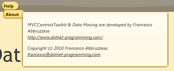
Menu
The Extended menu renders hierarchies of objects with either an horizontal drop-down menu
or with a vertical menu.
According to the setting passed with the menu fluent interface. The developer has also the option to change the default values of several rendering options:
Children menu items appear either on menu hover or on menu click, according to the setting passed with the menu fluent interface. The menu is rendered as a nested <ul> <li> list and the way the content of each <li> is rendered is defined by Row Types.
Different programmable behaviours may be triggered when a menu item is clicked. The menu is completely accessible since it may be navigated with the tab key and with the 4 arrows keys. Moreover it is Aria compliant.
It is possible to put each menu item in a Selected state. In this case all menu items on the path to the menu item remains opened till the menu item is unselected. As a possible application, one may select the menu item that navigates to an Html page when the user is in that page.
The way each menu item is rendered is defined with a Row Type, so each menu item may contain several columns, and the whole item template, being a Row Type Template, may be customized. Below a menu item based on a custom template:
Menu items may be enabled/disabled and manipulated from javascript code. The menu control may work also as a client control, and may be used to navigate through the virtual pages of a Single Page Application. A tutorial on building a context dependent menu ina Single Page Application may be found here.
Available a fluent interface to build the hierarchies of objects, to be passed to the menu.


